
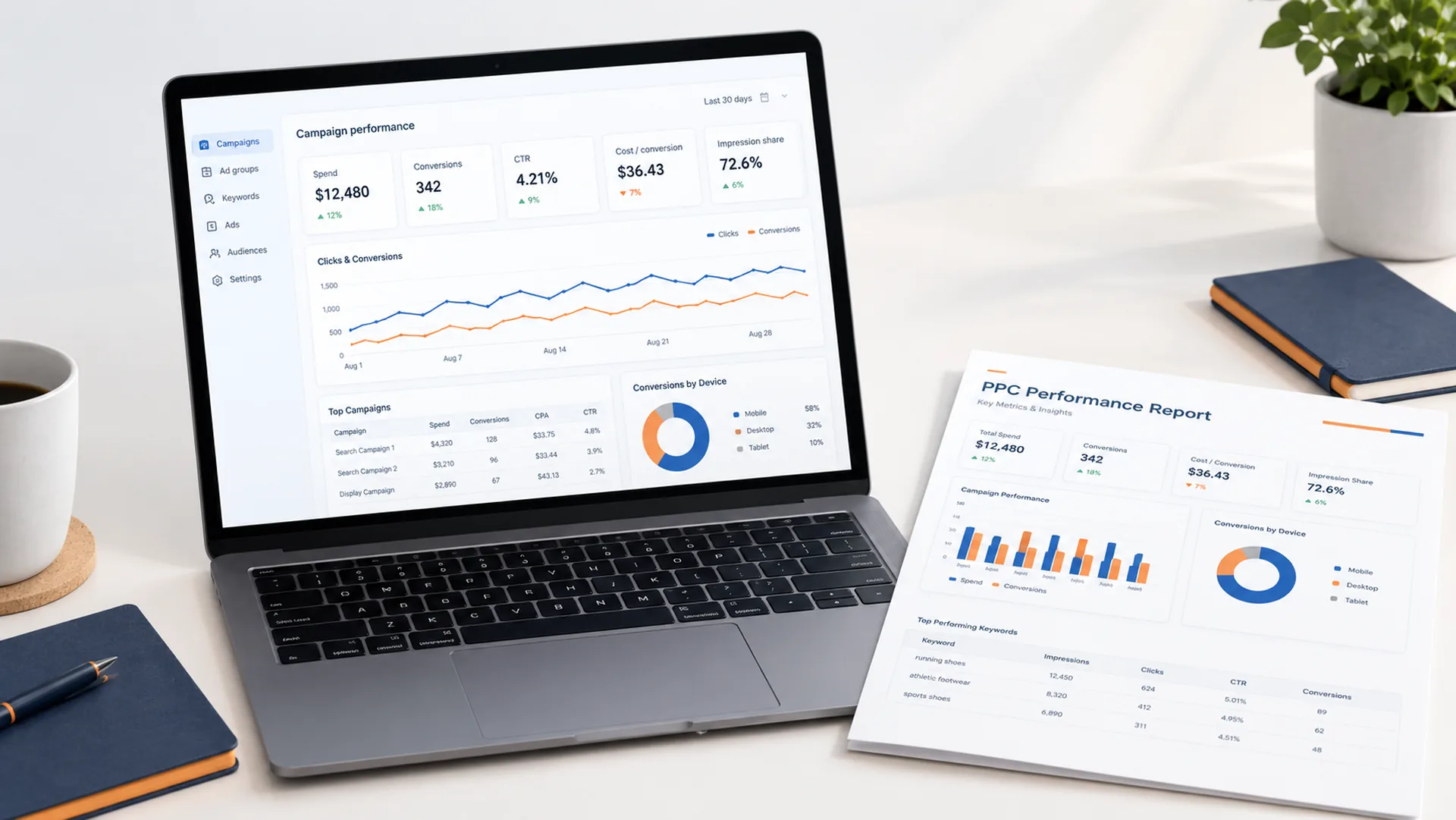
Quick answer: A PPC report is a structured summary of paid search performance — spend, conversions, cost per conversion, CTR, and impression share — organized so someone can decide what to change next without opening Google Ads directly. The six reports worth building are an executive summary, a campaign performance report, a search term report, an impression share report, a conversion path report, and a frequency & reach report. Below is exactly how to build each one, the metrics and KPIs that belong in them, and a free template.
Key takeaways:
- A good PPC report answers three questions: what happened, why it happened, and what to do next
- The core metrics every report needs: impression share, cost per conversion, CTR, conversion rate, frequency, and Quality Score
- Reporting cadence should match report type — search term reports weekly, executive summaries monthly or quarterly
- Client-facing reports need a different structure than internal ones (see the agency section below)
What Is a PPC Report?
A PPC report is a structured summary of paid search performance — impressions, clicks, cost, conversions, and the ratios between them — organized so a marketer or stakeholder can make a decision without digging through the raw Google Ads interface. The best PPC reports answer three questions: what happened, why it happened, and what to do next.
The Metrics Every Report Should Include
Before you build a report, you need to know which numbers earn a place in it. Here’s the shortlist, with definitions and formulas you can drop straight into a report template. This is a working shortlist for reporting purposes — for full definitions, benchmarks, and how to choose the right KPIs for your goals, see the dedicated PPC campaign metrics guide.
| Metric | Formula | What It Tells You |
|---|---|---|
| Search Impression Share | Impressions received ÷ Total eligible impressions | How much of the available auction volume you're actually winning |
| Cost Per Conversion | Total cost ÷ Total conversions | What you're paying, on average, for each result |
| Click-Through Rate (CTR) | Clicks ÷ Impressions | How compelling your ad is relative to what it's shown for |
| Conversion Rate | Conversions ÷ Clicks | How well your landing experience closes the click |
| Frequency | Impressions ÷ Unique users reached | How many times, on average, the same person sees your ad |
| Quality Score | Google's 1–10 rating (CTR, relevance, landing page experience) | How efficiently you're bidding relative to competitors |
These six make up the core of most ad performance metrics dashboards. Everything else — view-through conversions, assisted conversions, auction insights — is worth tracking but shouldn’t take up space in a standard recurring report; save it for the deep-dive reports below.
Search Impression Share — Why It’s the Metric Most Reports Miss
Impression share tells you what you can’t see in your conversion numbers: demand you’re leaving on the table. A campaign can have a great conversion rate and still be underperforming if impression share is low — it just means you’re winning a small, favorable slice of a bigger opportunity. Google Ads splits this into Lost IS (budget) and Lost IS (rank), and that split should always appear in your report, because the fix is completely different for each (raise budget vs. improve ad rank).
Cost Per Conversion — Setting a Benchmark
Cost per conversion only means something in context. Track it against:
- Your own historical average (30/60/90-day trend)
- Industry benchmarks for your vertical
- Your actual customer value (a €50 cost-per-conversion is fine if the customer is worth €500, and bad if they’re worth €40)
Report this as a trend line, not a single number — a snapshot cost-per-conversion hides whether you’re improving or declining. If you’re deciding whether CPA, CPL, or ROAS should anchor your reporting, see CPL vs CPA vs ROAS: Here’s Which One Actually Grows Your Business.
Frequency — The Most Overlooked Reach Metric
“Number of times” a user sees your ad matters most in display and video campaigns, but it’s increasingly relevant in search remarketing too. High frequency with flat conversions is a signal of ad fatigue or audience saturation — a report that only shows impressions and clicks will miss this entirely.
The 6 PPC Reports Worth Building
You don’t need a dashboard with 40 widgets. You need the right reports, built for the right audience. Reporting should be planned alongside the campaign itself, not bolted on afterward — see our Performance Marketing Campaign Setup Guide 2026 if you’re structuring an account from scratch.
1. The Executive Summary Report
One page. Spend, conversions, cost per conversion, and impression share — each with a trend arrow against the prior period. No campaign-level detail. This is the report a stakeholder reads in 30 seconds.
2. The Campaign Performance Report
Campaign-by-campaign breakdown of spend, conversions, CPA, and impression share, sorted by spend. This is where you spot the campaign quietly burning budget with no impression share to show for it.
3. The Search Term / Query Report
What people actually typed before your ad showed. This report exists to find negative keywords and new keyword opportunities — it should be reviewed weekly, not monthly.
4. The Impression Share Report
Isolates Lost IS (budget) vs. Lost IS (rank) by campaign. This is the report that tells you where more budget would actually convert into more results, versus where you need to fix ad relevance or bids first.

5. The Conversion Path / Attribution Report
Shows how conversions are actually happening — first-click vs. last-click, assisted conversions, and time-to-conversion. Without this, cost-per-conversion numbers on individual campaigns can be misleading, since some campaigns assist conversions that get credited elsewhere.
6. The Frequency & Reach Report
For display, video, and remarketing campaigns: average frequency, reach, and conversion rate by frequency bucket (1–2 views, 3–5 views, 6+ views). This is how you find the point of diminishing returns and cap frequency accordingly.
PPC Report Example: What a Finished Report Looks Like
Knowing the six reports is one thing; seeing how they sit together in a finished document is another. The layout below shows a complete PPC performance report with all six reports as panels: the executive summary up top, then campaign performance, search terms, impression share, conversion path, and frequency & reach.

Example: The Executive Summary, Written Out
Here is what the first panel looks like as a plain table. The numbers are illustrative sample data, not a real account.
| Metric | This Month | Last Month | Change |
|---|---|---|---|
| Spend | $8,600 | $7,800 | +10% |
| Conversions | 215 | 180 | +19% |
| Cost per conversion | $40.00 | $43.33 | −8% |
| CTR | 4.6% | 4.2% | +0.4 pts |
| Impression share | 68% | 61% | +7 pts |
The narrative under it matters as much as the numbers. A finished report explains what happened, why, and what comes next. For this sample:
- What happened: Spend rose about 10% but conversions rose about 19%, so cost per conversion fell by roughly 8%.
- Why: Impression share climbed to 68%, and most of the impressions still being lost come from the daily budget cap on the brand campaign rather than ad rank.
- What’s next: Raise the brand campaign budget, add the wasted-spend terms from the search term report as negatives, and refresh headlines on the non-brand campaign where CTR is below the account average.
That last block is what separates a report people act on from one they file away. If your report only shows the table, it’s a data export, not a report.
PPC Report Format: How to Structure Your Report
The best PPC report format is the same whether you’re reporting to a boss, a client, or yourself: lead with the answer, then show the evidence, then say what to do. In practice that gives you six blocks, in this order:
- Header: account or client name, reporting period, and the comparison period (last month, or the same month last year).
- Executive summary: spend, conversions, cost per conversion, CTR and impression share, each with change versus the comparison period.
- Performance narrative: two to three sentences on what moved and why.
- Campaign breakdown: one row per campaign, sorted by spend, using the same metrics as the summary.
- Deep-dive panels (as needed): search terms, impression share, conversion path, frequency & reach. Include only the ones that support the story you’re telling.
- Next-period recommendations: two or three specific actions, each with an expected impact. No more than three.
Match the format to the audience:
| Audience | Best format | Length | Cadence |
|---|---|---|---|
| Internal team | Live dashboard or working spreadsheet | As detailed as needed | Weekly for search terms; bi-weekly or monthly for campaigns |
| Client | PDF or shared dashboard link | Summary on page one, supporting detail after | Monthly |
| Executive / stakeholder | One-page summary | One page | Monthly or quarterly |
A few formatting rules hold up across all three:
- Show change, not just totals. A number without a comparison isn’t information.
- Keep the same metrics in the same order every period, so readers can compare reports without re-learning the layout.
- Put the summary on page one. Anyone who stops reading there should still know how the account is doing.
Want to skip building this from scratch? The free template below follows this exact format.
Google Ads Reports for Clients: What's Different

Client-facing reports need a different structure than the internal versions above. The goal shifts from “what should I fix” to “what am I paying for” — the client isn’t optimizing the account, they’re evaluating whether the spend is working.
A good client report:
- Leads with outcomes, not activity. Conversions and cost per conversion come before impressions or clicks — clients care about results, not effort.
- Translates jargon. “Impression share” becomes “share of available customer searches you’re winning.” Every metric gets a one-line plain-English explanation.
- Includes a narrative, not just numbers. Two to three sentences explaining why the numbers moved, written in the report itself — don’t make the client ask.
- Ends with next steps, not just historical data. Clients want to see the plan, not just the scoreboard.
- Strips internal diagnostics. Search term waste, bid strategy details, and account structure notes stay internal — they don’t belong in a client deliverable.
If you manage multiple client accounts, this is also where white-label reporting tools (Looker Studio with client branding, or a dedicated PPC reporting platform) start to pay for themselves over manually building each report.
Free PPC Report Template
A usable Google Ads report template needs, at minimum:
- Date range + comparison period
- Executive summary block (spend, conversions, CPA, impression share)
- Campaign-level table (the 6 core metrics above)
- Search term insights (top new terms, top wasted spend terms)
- Next-period recommendations (2–3 bullet points, no more)
This is a working Google Sheets template, not a static PDF. Paste your raw Google Ads export into the yellow cells and the Executive Summary, CTR, Conversion Rate, Cost per Conversion, and ROAS all calculate automatically — nothing to build yourself.
Get your copy of the PPC Report Template — click “Make a copy” to save it to your own Google Drive.
FAQ
What should you report on for Google Ads?
At minimum: spend, conversions, cost per conversion, CTR, and impression share, each compared against a prior period. Anything beyond that should map to a specific decision you’re trying to make — if a metric doesn’t change what you’d do next, leave it out of the report.
What's the best Google Ads reporting tool?
The native Google Ads reporting UI and Looker Studio cover most needs for free. Paid tools become worth it once you’re managing reports across multiple accounts or need automated client-facing dashboards.
How often should PPC reports be run?
Search term and budget pacing reports: weekly. Campaign performance and impression share reports: bi-weekly or monthly. Executive summaries: monthly or quarterly, matched to stakeholder review cycles.
What is the best format for a PPC report?
Lead with an executive summary (spend, conversions, cost per conversion, CTR, impression share, each compared to the prior period), follow with a short narrative on what moved and why, then the campaign breakdown, then two or three recommendations. Match the delivery to the audience: a live dashboard for internal teams, a PDF or shared dashboard for clients, and a one-page summary for executives.
What does a PPC report example look like?
A typical PPC report example opens with a one-page summary table comparing this period to the last, adds two or three sentences explaining the change, and then supports it with campaign, search term and impression share detail. The example section above shows a full six-panel layout and a written-out sample summary.
What is a good cost per conversion for Google Ads?
There’s no universal number — it depends entirely on your average customer value and margin. A cost per conversion is “good” when it’s meaningfully below what that conversion is worth to the business, with room for margin and reinvestment.
How do you analyze Google Ads data?
Start at the account level (spend, conversions, CPA trend), then drill into campaigns to find outliers, then into search terms to find why an outlier is happening. Analysis moves top-down: identify what changed before trying to explain why.
What should a Google Ads report for clients include?
Outcomes first (conversions, cost per conversion), a plain-English explanation of what moved and why, and a clear next-step plan — with internal diagnostics like search term waste or bid strategy notes left out.
Building and reading these reports takes time most in-house teams don’t have to spare. If you’d rather have someone else own the reporting — and the optimization decisions behind it — see how we approach it on our Google Ads Management service page.
Related Reading
- PPC Campaign Metrics: The Full Guide
- Running Ads Without Conversion Tracking? Here’s What You’re Bleeding. — for when your report numbers don’t match what you expect
- CPL vs CPA vs ROAS — Here’s Which One Actually Grows Your Business — choosing the right cost metric to anchor your reports on